The Joys of Limited Palettes
I graduated from art school with a degree in illustration in 2006. Immediately afterwards I set about building a career and part of that was reading everything I could find on the “hows” of making art. I’ve always been a process junkie, but I was probably my most voracious during this period of my life. Mostly I was looking for the magic trick of the palette that would set me up to paint anything I wanted. I went through several iterations: from the limited four-color palette of Anders Zorn all the way up to the overly full and intimidated thirty-color palette of Gil Elvgren. I tried everything I could find and mostly what I had was a lot of paint I never really used.
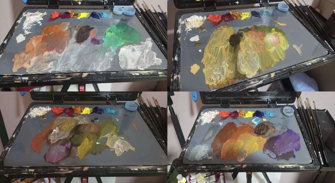
Eventually, after almost twenty years, I found a limited palette that has made me very happy. In my experiments over the past two years I haven’t found myself reaching for any additional tubes outside of the limited seven-tube set. The colors are as follows:
- Cadmium Red Medium
- Quinacridone Magenta
- India Yellow
- Cadmium Lemon
- Ultramarine Blue
- Cobalt Teal
- Lead White
It’s a deceptively simple split-primary set up — a warm and cool version of each of the colors (except white.) Over the past few months I’ve been mostly painting portraits and you can see from the photos of my palette at the end of each of the sessions that the flexibility of the chosen paints is impressive. I can create beautifully dark chromatic blacks by mixing the transparent pigments (quinacridone magenta, India yellow, and ultramarine blue) and most of my base flesh tones are comprised of the a balancing of the warms and cools (cadmium red medium, cadmium lemon, and cobalt teal.) It wasn’t until I started limiting my palette with the Zorn palette, which I’ll do a review of at a later date, that I really started understanding painting, but this palette has held the key to my next steps towards progress.
Everything has started to coalesce into better, more well-rounded paintings as I explore relative color temperature more intently. In theory any color can be mixed from the three primaries, but I think this palette takes it from the realm of theoretical and squarely into fact. If nothing else it will teach you very quickly (as it did with me) some of the fundamental differences in paint — weak vs. strong tinting strength, organic vs. synthetic, transparent vs. opaque, and, possibly the most important, warm vs. cool. So give it a try and let me know what you think!